Painting with Wilson Bickford
Wilson Bickford "New England Light" Part 2
Season 4 Episode 8 | 27m 13sVideo has Closed Captions
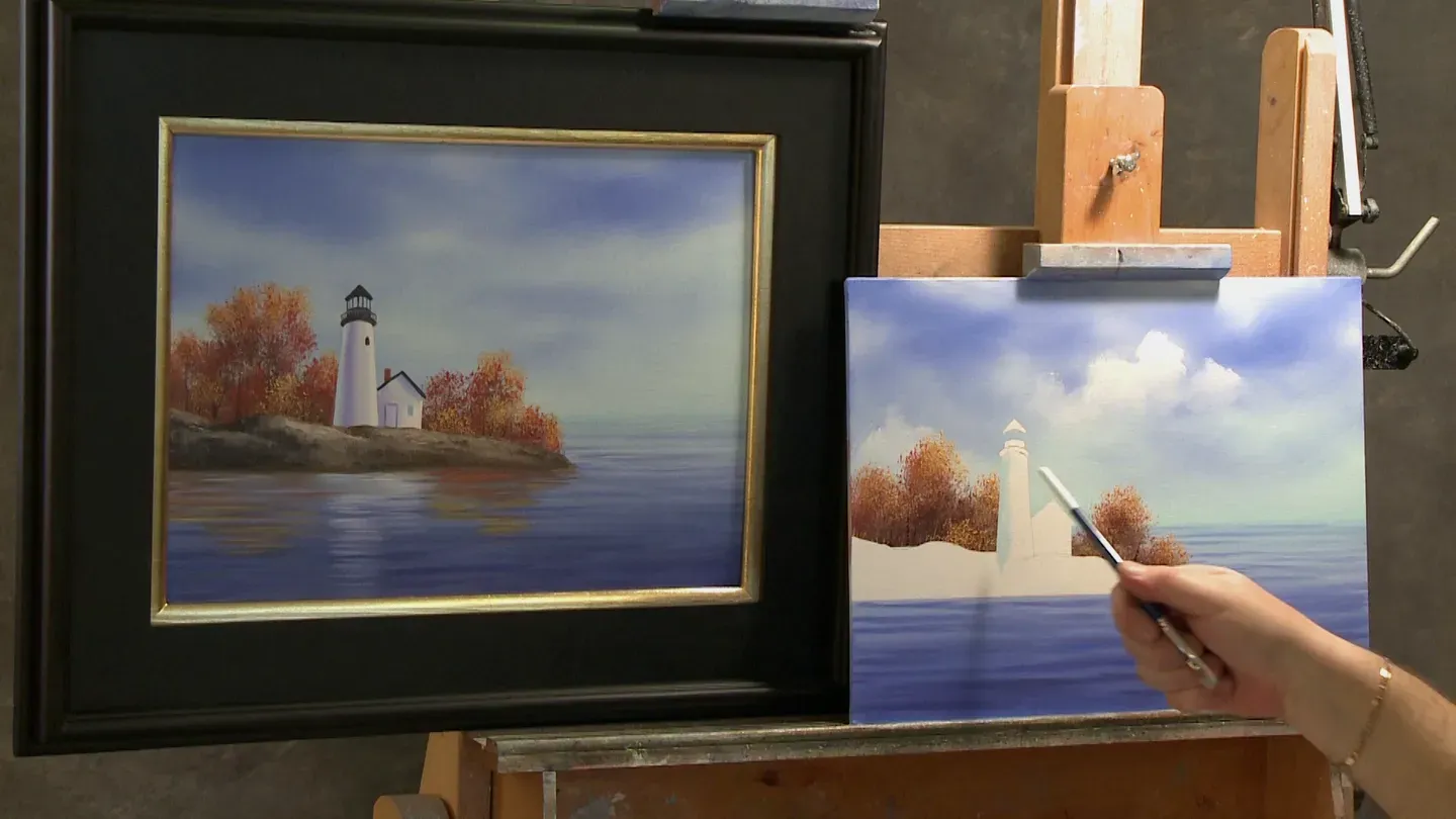
Wilson shows his technique to create a realistic lighthouse on a New England coast.
It’s fall, but the shipping season is still in full swing. A lighthouse guards a rocky shoreline on a New England coast. Wilson shows his technique to create realistic water and rocks.
Problems with Closed Captions? Closed Captioning Feedback
Problems with Closed Captions? Closed Captioning Feedback
Painting with Wilson Bickford is a local public television program presented by WPBS
Sponsored by: St. Lawrence County &nbps; &nbps; The Daylight Company &nbps; &nbps; J.M. McDonald Foundation
Painting with Wilson Bickford
Wilson Bickford "New England Light" Part 2
Season 4 Episode 8 | 27m 13sVideo has Closed Captions
It’s fall, but the shipping season is still in full swing. A lighthouse guards a rocky shoreline on a New England coast. Wilson shows his technique to create realistic water and rocks.
Problems with Closed Captions? Closed Captioning Feedback
How to Watch Painting with Wilson Bickford
Painting with Wilson Bickford is available to stream on pbs.org and the free PBS App, available on iPhone, Apple TV, Android TV, Android smartphones, Amazon Fire TV, Amazon Fire Tablet, Roku, Samsung Smart TV, and Vizio.
Providing Support for PBS.org
Learn Moreabout PBS online sponsorshipWilson Bickford: I can feel the crisp autumn air in New England.
Come join me next on Painting with Wilson Bickford as we finish up "New England Light."
[MUSIC] [MUSIC] Hi, welcome back and thanks for joining in with me again.
If you recall in the last episode, we had started "New England Light."
We taped out the lighthouse and the rock formation, dropped all of our background elements in, and now we're ready to start on this lighthouse.
I'm going to use my number six small flat brush and some of this white base coat that I applied to the background earlier.
I'm going to take just a little bit of this.
I'm going to paint the white tower here of the lighthouse and this little shanty where the lighthouse keeper lives.
You want to put this on sparingly.
I'm trying to work it into the weave of the canvas.
It doesn't matter if I come down below the rock edge there.
I'm going to zip that off of the rocks later.
No big deal.
I don't have to just take care and dance around with that.
I can just paint right down over it.
It's like running through first base.
You don't have to stop on first base.
I don't have to stop this line.
I can paint through it.
Don't make it any more difficult than it needs to be.
I'm going to put a little bit of this white here on the little shack, and then we're going to add some shading to it to give it all the shapes that they need.
We want that tower to look round.
Speaking of the tower, you'll notice here on the far left there's a very lightish blue color.
That's cerulean blue.
That's reflected light.
Next to that, it's a darker tone and it's got a little bit of purple in it, but it's darker.
That's the core of the shadow.
The light's coming from here, so we're going to leave it white on this side, but then you have the core of the shadow, which is the darkest part of any shadow.
Then there's reflected or bounced light on the back side of that.
It's usually in this type of a setting it would be just sky color reflecting back onto it.
It tends to make it look more round.
I've got some of this cerulean blue for my sky and water way back when.
It's the same ballpark.
If you didn't have any of that left, just take some white with a little bit of cerulean blue.
Easy fix, easy adjustment, easy color to get.
I'm going to chisel the brush up.
I'm going to lean in here and try to keep my shoulder out of the way.
I'm carefully going to paint down this side.
Don't stop at the rocks, go right through them.
You'll see if you try to stop at that line every time it makes it very hard.
Pull right through it.
Once you get your hand in motion, pull right through it.
I don't need to bring this around very far, but I want to bring it around at least a quarter of an inch or a little more because I'm going to blend the core of the shadow into it and push it back.
If I start out too narrow with it, I'm not going to have anything left.
I'm going to cut into that with the core of the shadow.
If this competes with the background, you have to make an adjustment.
See how this one stands out so much cleaner?
It's because my sky was darker behind it.
This one I've got to go either a little lighter with my shadow tone here, my reflected light, or darker in the sky.
It's not a mistake.
It's an adjustment.
See, if I use a little more white, I get more contrast so it brings that lighthouse out against the sky.
I could do it the opposite way too.
This is a good lesson just to show you.
If I took a little touch of this ultramarine blue that I had way back when, not much, I don't want it very strong, I don't want it noticeable, I can sneak a little more of that darker blue against it in the sky.
Just anything to make that contrast.
Now, I've got to hold my hand up like this.
It's going to create a shadow I know.
I just wanted to show you that just so you know.
Painting is nothing but a series of adjustments.
You're going to run into stuff like that all the time, so it's important to know how to correct it.
Okay, I have the same brush.
I've got it wiped out.
I'm going to take a little bit of this ultramarine blue I had earlier and a speck of the purple.
This will be the core of the shadow.
If you know in your heart it's too dark, mine is, just add a little more white back into it.
Again, chisel the brush up.
Anything in the blue-gray to purply-gray range is acceptable for shading on white.
You could use the blue.
You could use the purple.
I've kind of mixed them together.
This is going to be a little darker than that one I think, but I wanted to do it a little darker so it shows up on camera for you.
I'm going to come right down through like that, right up underneath where that black catwalk is going to be.
See how I left that light blue on the edge?
I'm going to wipe the brush off because I want to blend and I need to soften the line between the blue and the purple and the white and the purple on this side.
Everybody tries to do it this way.
That's much more difficult.
If I put half the brush on the blue, half the brush on the purple so the line is in the middle of the brush and I just go up and down like this, you'll see that they soften right together.
I need to take that edge out of it so that it looks rounded.
How easy was that?
So much more easy to blend that vertically.
Same thing here.
I want to destroy that line, but I want to maintain white on the right-hand edge of that tower.
My brush is pretty dry because I wiped it right off.
I'm blending.
I'm not painting.
Just need to feather that edge away.
If you happen to lose it, you could always put more white in there.
That looks pretty good to me.
I could leave it, but just in the interest of teaching if I take a little more white, this is the thicker white, I can always come back and adjust that, put a little more white there.
Same as before, I need to wipe the brush and kind of blend it against the purple.
Nothing to it, right?
You betcha.
You could do that.
I know you could.
Okay, I'm going to take a little bit of this cerulean blue mixture I had on the back of the lighthouse on the tower.
Because the white building is against the white tower, there's no distinction there.
I've got a little bit of a graphite line from my sketch, but I don't want that to do the job.
I want to hide that graphite line.
See, if I put a little touch of shading in there, it kind of separates those two.
It looks like the tower is a little bit in front of the house and the house is around the corner.
I could also put just a speck of this purply color.
I don't want to get it very strong.
Just enough to say so.
I'm thinking just shadow on white.
As it goes across the face of the house, I just let it blend away.
I'm not painting the whole house blue.
Just putting just enough there to get the job done.
Okay, I'm analyzing this.
I'm looking at it as I'm doing it, and I'm thinking I want a little more white back on my tower.
Not a mistake, it's an adjustment.
I'm just analyzing it as I'm going.
I'm just comparing it to that one, and I don't have to match that one exactly to show you my approach.
I'm going to get a little more light on there.
I don't think that'll hurt a thing.
There we go.
There, I like that a little nicer.
Likewise, I'm going to put a little more purple tone here.
Just a touch.
See, I'm going in baby steps.
Just enough to get the job done.
Okay, you'll notice that there's a cast shadow from the roof line overhang.
Anything in this bluish-purply range here is going to work.
Don't let it get too purple or too blue.
If you need to gray it, if you did need to gray it, you could add just a speck of the Van Dyke brown.
If it's just overall too dark, you can lighten it with white.
I'm going to hold my hand this way and just pull across.
It's going to look a little odd here at first, but it'll make perfect sense once I put the roof line on there, the actual roof line.
This is a cast shadow from the roof onto the face of the building.
I'm going to square that off a little bit here on the bottom.
It's a shadow, so it can afford to be a little softer, somewhat softer edge.
All right, see how that gives that a lot of form and dimension?
Okay, I'm going to switch over to my detail script liner.
We got a lot of work to do up on that little cupola up on the top.
I'm going to save that for last.
I'm going to take some cerulean blue and white and put in a little window.
If I paint in some blue, it looks like glass that's reflecting some sky color in it.
If I paint it black, it just looks like an open hole.
I want it to look like there's glass in that window.
This is the detail script liner with titanium white and a little bit of cerulean blue.
If you notice if I pull the brush back like this then flatten it out on two sides, it gets a little squarish kind of.
It makes it really easy to come in here and just pull down a window.
Pretty easy.
I'm going to go a tad darker with that.
I'm going to put just a touch of the ultramarine blue into color just so it shows up.
There we go.
It shows up a little nicer.
See, I'm always thinking about the contrast, light against dark, dark against light.
There's no sense painting something in there if it's not going to show.
I can actually take that same color and this time same brush and I'm going to roll the brush to a point.
I've added just a drop of mineral spirits here.
I'm carefully going to get in here and lean.
I'm going to put a shadow around the door casing, which suggests a door there.
This is where the light keeper has to go in and out, his living quarters.
You don't take much to suggest a door.
I'm going to take orange.
Orange?
This is cad red light, very orangy.
With some of this cad red light and a speck of brown, just a speck of brown, I want something kind of a brick color.
Again, I flatten the brush out on two sides like I did before.
Notice there's a chimney on the building.
This little lighthouse keeper needs a stove in there to keep him warm.
He's probably got a cookstove in there where he fries his eggs in the morning.
Can't cook without a chimney, so I'll put a little chimney on there.
I'm going to mix up a black.
I don't have black in my palette, but I can make it very easily.
If I take Van Dyke brown with a little bit of the ultramarine blue, ratio I would say probably 80% brown, 20% blue, look how black that is.
You get a virtual black.
I've got the roof line here.
Now you could take the yellow and blue and make a green and put a green roof on here if you wanted to.
It's all good.
I'm going to paint the roof line on like that.
See, now, that cast shadow from that roof line kind of makes more sense.
There's something there to cause it.
Here's where we have to really get a little persnickety and a little more careful.
I'm going to paint in this whole area up here on the top black.
I know I got the railings and whatnot on there.
Those are coming after the fact.
I've also got this little window in the tower.
I'm going to put this on.
I'm using my little stick here to steady my hand.
Sometimes your best friend will be a dowel from the hardware store.
This was the best 69 cents I ever spent.
It's good for steadying my hand.
Okay, now, I'm going to paint in all of this area that's still taped out, all these areas right across here.
This is going to take me a couple minutes, so I'll hop off here and I'll be right back.
[MUSIC] To add some life to your painting, put some birds in the sky.
In previous lessons, I've shown you how to do the silhouetted ones.
In this one, I'm going to do one a little more detailed.
If you take some of the white base coat on your detailed script liner, put in the basic white, the core shadow purple color that we used earlier on, you can use some of that to put some shading on him, this will give him much more of a three-dimensional form, more detail than the other ones further away.
With the black that we used on the lighthouse, you can put a little bit of black on the wingtips and on his tail.
It's a nice day at the lighthouse.
Okay, I'm just finishing up all of this black area up here.
This is going to be your touchiest stuff.
This and the railings that are coming next.
You really got to take your time with this.
You'll have a lot of time at home.
When I'm holding my breath here, it's just because I'm trying to steady my hands.
When I quit talking, it gives you a break and it steadies my hands, so we're both winners on that, right?
All right.
Okay, now when you get ready to do the railings on the sketch that I provided, now obviously if you're doing your own lighthouse design you'd have to use your own reference material, but on the sketch that I provided for you to transfer, I've got a closeup.
It says "closeup reference for railings".
Doesn't get much easier than that.
I would recommend using that, keeping that right at the ready so you can use that.
There's going to be the spines, I guess I would call them, in between the glass panes that connect the little cap to the cupola, and then you've got the railings around.
I'm going to do that right now.
I've switched over to the liner brush.
This is the liner not the detail script liner.
I'm going to take some of this thin black like I had before.
Don't load it for bear.
This is loading for bear.
See, if I scoop it right up and it's really full, the minute I touch it the line is going to be too big.
It's going to make a blob.
I'm hunting for squirrel.
I would never do that.
I would never kill a squirrel or a bear, but don't load your gun for bear if you're only hunting a squirrel.
That's how I say that.
I'm going to load it up.
I'm going to take a little bit of the paint out of the brush then it's not so prone to getting a blob.
I'm going to use my little steady stick here.
I'm not going to count how many I've got on there.
I'm just going to do it.
But perspectively speaking, these will look a little farther apart in the middle and as they wrap around they're going to appear closer together because it's round.
Has to do with linear perspective.
You'll see each subsequent one that I put in there.
I make it a tighter space between them.
That makes perfect sense perspectively speaking.
Okay, I'm going to clean that edge up.
I dragged a little bit of the sky color through there with it.
Okay, that's the glassed-in area.
Now, we've got to do the railing and spindles.
Now black on black is not going to show, so you'll notice on this one I did a little bit of a gray tone.
If I take this black and I add a little bit of white, I'll use some of this white base coat I've still got lying here.
You don't need to go too light but just light enough so it's going to show up against that background.
Again, I'm going to load this brush up like this.
I've thinned it down.
Load it up, take a little bit of the paint out of the brush.
The curve on that railing on the top matches the curve of everything else that's here.
That's a little bit above it, so again I'm going to quiet my mouth here to steady my hand and just put that on there.
I'm not sure that's going to show for you, so I'm going to lighten it and do it again.
Ideally, you want to hit it in one shot.
I hate doing it again, but just in the interest of making sure you're seeing it I've got to do it.
I'm taking one for the team.
There we go.
That shows up better.
See, on the edges it wraps around, so it's going to come around because it goes around the lighthouse.
I'm going to put a little hook, my stick slid, and bring it around.
I got a little blurb there.
I'll clean that on my stick, skid it across my easel here.
Then I'm going to take the same brush and I'm going to matte it out on two sides.
Kind of like I did with the detail liner earlier.
I need to put the little upright spindles in there.
Same as the ones in the glass.
They're going to look a little further apart in the middle and as they wrap around towards the sides they're a little tighter together.
All right.
Now that's where all the detail is in this painting, so you want to proceed slowly and take your time with that part.
I'm going to swish this number two detail script liner out and that little blurb where my stick slid.
I'll show you.
That's an easy fix.
If I take a clean brush with nothing on it, that little spot of gray right there you might not even be able to see it.
I can see it here right now and it's driving me nuts.
I can just blend that away and take that right off, shave it off.
There we go.
Nothing to it.
That's looking pretty good.
Okay, that's pretty much how we're going to do the lighthouse.
Now, for the rock ledge I'm going to use my painting knife to do the highlight.
I'll base it in with the number 10 flat brush first.
I'm just going to take brown and I'm just going to base this in nice and solid and dark.
I'll highlight it with the knife.
See, this area of the canvas is dry.
There's no base coat.
That's why it scrubs on a little harder.
You'll see me working it into the weave of the canvas.
Try to get a nice crisp edge across your lighthouse here.
I'm kind of working a little faster here than I normally would, but as I'm always saying take your time at home.
By the way, I don't necessarily paint this quickly when I paint at home.
I can paint fairly quickly and most paintings I do only take me two or three hours.
If I spend four or five hours on one it seems like it's a lot, but it's just because I'm so used to it and I know exactly what I want to get for an end result.
I don't have to search for it as I'm doing it.
I've already got it worked out ahead of time in my mind so I know exactly what I'm shooting for.
When you paint at home, just take your time.
I want to get a nice straight line across here.
Let me see, that wasn't too bad, pretty straight.
If it's not, I can fix it with our reflections.
Let's see, once I get this based in dark I'm going to use my painting knife, which is a great texturing tool.
I'll take this out of the way.
Notice how the rock texture has a lot of interest in it.
I'm going to set this brush right in the thinner here to kind of start softening the paint because I'm going to come back with that clean here in just a minute.
I'm going to use my painting knife.
If I take titanium white with some of this brown and use a light touch, I'm kind of going with the flow of the way the rocks look.
They look like they're kind of angled down this way.
I kind of put the paint on and pat it and move it around a little bit.
It's easy to blend it in because the dark brown underneath is wet.
Don't lose all the dark brown.
Those are your little shadows in the nooks and crannies.
I usually come back and do a re-highlight in a couple spots, especially around the lighthouse.
Let it stay a little darker as it comes over the edge here.
It looks like it's rounding off to the water.
You'll hear me scraping once in a while.
Let's see what an interesting texture that knife gives you as compared to using a brush for that.
I love using the knife for that sort of a texture.
Okay, to jazz this up just a touch I'm going to take a little more white into that mixture and a little touch of yellow.
I don't want it to be a screaming yellow.
I want kind of a dirty yellow.
See, that's a pretty ugly color on its own, but where I'm going to put it it's going to work fine.
I want it to look like there's some sunlight coming in here near the base of the lighthouse and zing in a little extra light in there.
I'm going to add a little more white to that even.
Now see, it looked good on my palette when I put it up there.
It wasn't quite light enough.
There we go.
That's better.
Because those rocks have many facets and angles to them, the light's not all going to hit it equally on the same spots.
See how that really breaks that up?
All right, we need some reflection in here.
If I take this number 10 flat brush all washed out, I'm going to use my same color as my fall colors that I had before.
I've still got them right here in my palette.
I'm going to start with some of the darker red.
I've got to slide over here in the middle a little bit.
I've chiseled the brush up.
See, I'm just kind of doing those same horizontal lines I did when I did my wave movements earlier.
Put a little bit of this in.
If you run out, just take a little more of the orange with it.
Notice I'm not putting it where the white of the lighthouse is going to be.
That's going to make a mess.
I'm going to take some of the yellow, yellowy-orange that I had.
I'll swoosh this out really quickly.
I'll even brighten it up a little more.
A little more yellow and white.
Chisel the brush up.
I'm going to put it right in over the top of this.
Now, I'm picking up some blue as I'm doing it, so be careful you don't get too much green going on.
You want to keep wiping your brush off.
Reload with more yellow and white as need be.
I need to swish the brush out one more time for all the white of the lighthouse.
For that, I'm just going to use titanium white.
I'll chisel the brush up nice and sharp.
Right in line with the lighthouse, you're going to pull a little bit of the white base coat with it if need be, if it feels like it's not coming off your brush cleanly.
Now just like we did the water earlier and the wave lines, we're going to waterize this.
I need to blend this a little bit.
See, it looks pretty rough right now.
I need to mingle these colors together a little bit.
For that, I'm going to use a clean fan brush.
I happen to have one right here.
Very lightly just kind of skim across.
You want to smudge it out of focus a little bit but not blend it so much you lose the lines.
It's just enough to indicate a reflection.
I got just about a minute here.
Just enough time to put a few rocks in.
I'm going to take some of the straight Van Dyke brown on my number six flat brush.
I think it balances it out better if we put a few little rocks here in the water.
Basically, all you need to do is put a basic rock shape.
Make sure it's flat on the bottom so it looks like it's in the water at our eye level.
Don't be afraid to put some over here in the reflection.
That really pushes the reflection down.
Underneath, I'm going to chisel the brush, put a few little ripples of reflection riding on that, riding on the water.
I can wipe this off, and with my rock highlight touch a little bit of highlight on the right-hand sides of those.
There you have it, New England Light.
I hope you enjoyed this lesson.
It was great to be able to bring it to you.
This has been one of my popular classes and my students really enjoy it.
Hope you do too.
Until next time, stay creative and keeping painting.
ANNOUNCER: All 13 episodes of Painting With Wilson Bickford, Series #4 are now available on DVD or blu-ray in one boxed set for $35 plus $4.95 shipping and handling.
Or learn the techniques used to paint "Evening Choir Practice" or "Majestic Mountain" with the in-depth Wilson Bickford "Paint Smart Not Hard" series of instructional DVDs.
Order online or watch or download directly to your computer or mobile device.
Moreinformation at wpbstv.org/painting.
[MUSIC] [MUSIC] [MUSIC]


Support for PBS provided by:
Painting with Wilson Bickford is a local public television program presented by WPBS
Sponsored by: St. Lawrence County &nbps; &nbps; The Daylight Company &nbps; &nbps; J.M. McDonald Foundation